Data Science Essentials
Filed under:
One the greatest strengths of R for data science work is the vast number and variety of packages and capabilities that are available. However, it can be intimidating to navigate this large and dynamic open source ecosystem, especially for a newcomer. All the information you need is out there, but it is often fragmented across numerous stack overflow threads and websites.
In an attempt to consolidate some of this information, this blog post demonstrates fundamental methods that I have used repeatedly as a data scientist. This code should get you started in performing some essential and broadly useful data science tasks with R - data manipulation, summarization, and visualization.
I will mainly rely on the dplyr, tidyr, and ggplot2 packages which all have excellent documentation that you can refer to for further details. Datasets that are built into these packages will be used so that there is no need to download external data. Also note that the input and output datasets will be displayed for each example, but at times only the first several rows will be shown for display purposes.
If you’d like to follow along while running the code, you can find the RMarkdown file that generated this blog post here. Also, if you haven’t installed the tidyverse packages already, you’ll need to do that first with this command: install.packages('tidyverse').
Basic Data Manipulation
To begin, we need to load the tidyverse packages:
library(tidyverse)
Now, let’s take a look at the mpg dataset from the ggplot2 package:
| manufacturer | model | displ | year | cyl | trans | drv | cty | hwy | fl | class |
|---|---|---|---|---|---|---|---|---|---|---|
| audi | a4 | 1.8 | 1999 | 4 | auto(l5) | f | 18 | 29 | p | compact |
| audi | a4 | 1.8 | 1999 | 4 | manual(m5) | f | 21 | 29 | p | compact |
| audi | a4 | 2.0 | 2008 | 4 | manual(m6) | f | 20 | 31 | p | compact |
We’ll perform a few of the most commonly used data manipulation operations on this dataset using the dplyr package. If you’re new to R, the <- operator that you see below is used to assign the value of what follows it to the dataset that precedes it. In this example, we are manipulating the ‘mpg’ dataset and saving it as the ‘mpg_subset’ dataset.
If you’re not familiar with dplyr, note that the “pipe” operator %>% is used to pass the output of a function to the following function. This allows us to perform data manipulations in sequence in a clear and readable way.
In this example, we select the two rows that contain Nissan vehicles years 2005 and later with 4 cylinders, create two new columns, order the columns, remove four columns, and rename a column. In the order that they are used below, here are the main functions used to accomplish this:
- filter controls which rows we want to keep from the input dataset. In this example, three conditions are applied using the “&” (AND) operator.
- mutate is used to create new columns.
- str_c combines multiple strings. In this case we are combining the manufacturer and model string fields into a single field with a single space in between.
- select is used to pick which columns from the input dataset we want to keep. This select statement sets the order of the first four columns, includes the remaining columns, but then removes four columns.
- A ‘-’ before a column name indicates that we want to remove that column.
- The everything() function is shorthand for selecting all remaining columns and is an example of a select helper.
- rename is used to rename the ‘fl’ column to ‘fuel_type’
mpg_subset <- mpg %>%
  filter(cyl == 4 & year >= 2005 & manufacturer == "nissan") %>%
  mutate(
    mpg_ratio = hwy / cty,
    make_model = str_c(manufacturer, " ", model)
  ) %>%
  select(
    make_model, year, hwy, cty, everything(),
    -manufacturer, -model, -drv, -trans
  ) %>%
  rename(fuel_type = fl)
| make_model | year | hwy | cty | displ | cyl | fuel_type | class | mpg_ratio |
|---|---|---|---|---|---|---|---|---|
| nissan altima | 2008 | 31 | 23 | 2.5 | 4 | r | midsize | 1.347826 |
| nissan altima | 2008 | 32 | 23 | 2.5 | 4 | r | midsize | 1.391304 |
Summary Statistics
Calculating summary statistics like counts, means, and medians is a good initial step to understand a dataset. To count observations (rows) by a categorical variable, we can use the count function. Here we find the number of rows for each value of the ‘cyl’ (cylinders) column:
count_cyl <- mpg %>%
  count(cyl)
| cyl | n |
|---|---|
| 4 | 81 |
| 5 | 4 |
| 6 | 79 |
| 8 | 70 |
A broader variety of statistics can be calculated using the group_by and summarize functions. In this example, we create a new categorical column ‘class_c’ (which combines 2 seaters and subcompact vehicles into a single category) using the case_when function and then calculate a variety of basic summary statistics by this column.
The arrange function is used to order the rows in the dataset in descending order of the created ‘count’ variable. Note that the ‘ungroup’ function is not strictly necessary in this case, but it is a good practice if we plan to manipulate our dataset in the future without using groups.
mpg_stats <- mpg %>%
  select(class, hwy) %>%
  mutate(class_c = case_when(
    class %in% c("2seater", "subcompact") ~ "subcompact",
    TRUE ~ class
  )) %>%
  group_by(class_c) %>%
  summarize(
    count = n(),
    min_hwy = min(hwy),
    max_hwy = max(hwy),
    median_hwy = median(hwy),
    mean_hwy = mean(hwy)
  ) %>%
  ungroup() %>%
  arrange(desc(count)) # sort dataset
| class_c | count | min_hwy | max_hwy | median_hwy | mean_hwy |
|---|---|---|---|---|---|
| suv | 62 | 12 | 27 | 17.5 | 18.12903 |
| compact | 47 | 23 | 44 | 27.0 | 28.29787 |
| midsize | 41 | 23 | 32 | 27.0 | 27.29268 |
| subcompact | 40 | 20 | 44 | 26.0 | 27.72500 |
| pickup | 33 | 12 | 22 | 17.0 | 16.87879 |
| minivan | 11 | 17 | 24 | 23.0 | 22.36364 |
Stacking Data
If you have datasets whose columns or rows align, you can combine them by stacking the datasets vertically or horizontally. To demonstrate this, we will first use the slice function to subset the ‘mpg’ dataset by row numbers to create the ‘mpg1’ and ‘mpg2’ datasets.
mpg1 <- mpg %>%
  slice(1) %>%
  select(manufacturer, model, hwy, cty) %>%
  mutate(dataset = 1)
| manufacturer | model | hwy | cty | dataset |
|---|---|---|---|---|
| audi | a4 | 29 | 18 | 1 |
mpg2 <- mpg %>%
  slice(44:45) %>%
  select(manufacturer, model, hwy, cty) %>%
  mutate(dataset = 2)
| manufacturer | model | hwy | cty | dataset |
|---|---|---|---|---|
| dodge | caravan 2wd | 17 | 11 | 2 |
| dodge | caravan 2wd | 22 | 15 | 2 |
Since these two datasets we just created have the same columns we can stack them vertically using bind_rows:
mpg_stack_vert <- mpg1 %>%
  bind_rows(mpg2)
| manufacturer | model | hwy | cty | dataset |
|---|---|---|---|---|
| audi | a4 | 29 | 18 | 1 |
| dodge | caravan 2wd | 17 | 11 | 2 |
| dodge | caravan 2wd | 22 | 15 | 2 |
Now let’s create a third subsection of the ‘mpg’ dataset using the same rows that generated ‘mpg1’ and ‘mpg2’ above, but with different columns. We’ll call it ‘mpg3’:
mpg3 <- mpg %>%
  slice(1, 44:45) %>%
  select(displ, year)
| displ | year |
|---|---|
| 1.8 | 1999 |
| 3.3 | 2008 |
| 3.8 | 1999 |
We can stack the ‘mpg_stack_vert’ and ‘mpg3’ datasets horizontally since their rows align (we used the ‘slice’ function to subset the ‘mpg’ dataset on the same row numbers). We use the bind_cols function to do this.
mpg_stack_horz <- mpg_stack_vert %>%
  bind_cols(mpg3)
| manufacturer | model | hwy | cty | dataset | displ | year |
|---|---|---|---|---|---|---|
| audi | a4 | 29 | 18 | 1 | 1.8 | 1999 |
| dodge | caravan 2wd | 17 | 11 | 2 | 3.3 | 2008 |
| dodge | caravan 2wd | 22 | 15 | 2 | 3.8 | 1999 |
Joining Data
If you have datasets that contain a common “key” column (or a set of key columns) then you can use one of the join functions from dplyr to combine these datasets. First let’s create a dataset named ‘car_type’ which contains the unique combinations of the ‘manufacturer’, ‘model’, and ‘class’ column values using the distinct function.
car_type <- mpg %>%
  select(manufacturer, model, class) %>%
  distinct()
| manufacturer | model | class |
|---|---|---|
| audi | a4 | compact |
| audi | a4 quattro | compact |
| audi | a6 quattro | midsize |
| chevrolet | c1500 suburban 2wd | suv |
Now we will join this newly created ‘car_type’ dataset to the ‘mpg_stack_horz’ dataset (created above) using the ‘left_join’ function. The ‘manufacturer’ and ‘model’ columns are used as joining keys. The resulting dataset, ‘joined’, now contains all the columns from ‘mpg_stack_horz’ as well as the ‘class’ column from the ‘car_type’ dataset.
joined <- mpg_stack_horz %>%
  left_join(car_type, by = c("manufacturer", "model")) %>%
  select(-dataset, everything()) # make the 'dataset' column last
| manufacturer | model | hwy | cty | displ | year | class | dataset |
|---|---|---|---|---|---|---|---|
| audi | a4 | 29 | 18 | 1.8 | 1999 | compact | 1 |
| dodge | caravan 2wd | 17 | 11 | 3.3 | 2008 | minivan | 2 |
| dodge | caravan 2wd | 22 | 15 | 3.8 | 1999 | minivan | 2 |
Converting Long to Wide Format
Let’s take a look at the us_rent_income dataset from the tidyr package:
| GEOID | NAME | variable | estimate | moe |
|---|---|---|---|---|
| 01 | Alabama | income | 24476 | 136 |
| 01 | Alabama | rent | 747 | 3 |
| 02 | Alaska | income | 32940 | 508 |
| 02 | Alaska | rent | 1200 | 13 |
Each row of this dataset pertains to either income or rent as we can see by looking at the value of the ‘variable’ column. This is an example of a “long” data format. The long format is versatile and desirable for data manipulation, but we may want to convert to the “wide” data format in some cases, particularly for presenting data.
To perform this conversion, we can use the pivot_wider function from tidyr. The end result is that the rent and income variables are put into separate columns. This function has two arguments you will need to set:
- names_from: name of the column which contains values that will become our new column names.
- values_from: name of the column which contains the values that will populate our new columns.
Additionally we use the select function to drop two columns, drop_na to remove rows with missing values, and mutate to create an income to rent ratio.
col_ratio <- us_rent_income %>%
  select(-GEOID, -moe) %>%
  pivot_wider(names_from = variable, values_from = estimate) %>%
  drop_na() %>%
  mutate(income_rent_ratio = income / (12 * rent))
| NAME | income | rent | income_rent_ratio |
|---|---|---|---|
| Alabama | 24476 | 747 | 2.730478 |
| Alaska | 32940 | 1200 | 2.287500 |
| Arizona | 27517 | 972 | 2.359139 |
Converting Wide to Long Format
Now let’s look at the world_bank_pop dataset from tidyr (only the first 6 columns are shown for display purposes):
| country | indicator | 2000 | 2001 | 2002 | 2003 |
|---|---|---|---|---|---|
| ABW | SP.URB.TOTL | 42444.000000 | 43048.000000 | 43670.000000 | 44246.00000 |
| ABW | SP.URB.GROW | 1.182632 | 1.413021 | 1.434559 | 1.31036 |
| ABW | SP.POP.TOTL | 90853.000000 | 92898.000000 | 94992.000000 | 97017.00000 |
This dataset is in “wide” format since a categorical variable, in this case the year, is stored in the column names. To convert this dataset to the “long” format”, which can be more convenient for data manipulation, we use the pivot_longer function from tidyr. This function takes three inputs:
- cols (1st argument): a list of the columns we want to pivot. In this example we create this list by subtracting the columns we don’t want to pivot.
- names_to : the name of new column which will have the current column names as values.
- values_to : name of the new column which will contain values.
We also use the ‘mutate’ and ‘as.numeric’ functions to convert our new ‘year’ variable to numeric and then filter so that our output dataset only includes certain years using the ‘seq’ function. The across function is used to apply the ‘as.numeric’ function to the ‘year’ column. The format for the ‘seq’ function is seq(start, stop, increment).
wb_pop <- world_bank_pop %>%
  pivot_longer(c(-country, -indicator), names_to = "year", values_to = "value") %>%
  mutate(across(year, as.numeric)) %>% # convert to numeric
  filter(year %in% seq(2000, 2016, 2))
| country | indicator | year | value |
|---|---|---|---|
| ABW | SP.URB.TOTL | 2000 | 42444 |
| ABW | SP.URB.TOTL | 2002 | 43670 |
| ABW | SP.URB.TOTL | 2004 | 44669 |
Visualizations
Now that we have manipulated and summarized some datasets, we’ll make a few visualizations with ggplot2. Ggplot graphs are constructed by adding together a series of ggplot functions with the “+” operator. This gives us a large amount of customization options since ggplot functions can be combined in many different ways.
Below you will find code for several commonly used charts, but you can refer to ggplot’s documentation for more information. Here is a brief overview of the package:
- The ggplot function initializes a graph and typically specifies the dataset that is being used.
- Atleast one geom (geometric object) function such as geom_histogram, geom_point, or geom_line is included which controls how data will be displayed.
- The aes (aesthetic mappings) function controls which variables are used in the plot. This function can be included as part of the ggplot function or in a geom function depending on whether you want the effect to be global or specific to a geom function.
- The formatting of the chart (such as margins, legend position, and grid lines) can be modified using preset themes such as theme_bw and theme_classic or the theme function which gives more manual control.
- The ‘color’ parameter is used for setting the color of plot lines and points while the ‘fill’ parameter controls the color of areas (such as bars on bar charts). These parameters can be set to a value such as ‘navy’ or to a categorical variable. You can read more about this on ggplot’s site here.
- To save a plot to a file use the ggsave function.
Scatter Plots
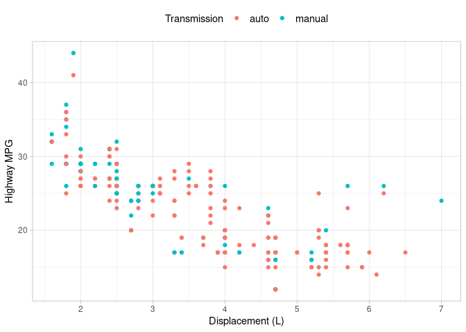
Scatter plots are used to visually examine the relationship between two continuous variables and can be created using geom_point. In this example, we plot engine displacement against highway MPG for the ‘mpg’ dataset. A ‘Transmission’ column is created to combine the various transmission types in the ‘trans’ variable into the ‘auto’ (automatic) and ‘manual’ categories using the str_detect function.
The ‘color’ argument in the ‘aes’ function is used to color our points according to the newly created ‘Transmission’ variable. A legend is automatically created and we’ve positioned it at the top of our graph.
ggplot(
  data = mpg %>%
    mutate(Transmission = case_when(str_detect(trans, "auto") ~ "auto", TRUE ~ "manual")),
  aes(x = displ, y = hwy, color = Transmission)
) +
  geom_point() +
  theme_light() +
  theme(
    legend.position = "top",
    legend.text = element_text(size = 11)
  ) +
  xlab("Displacement (L)") +
  ylab("Highway MPG")
Line Charts
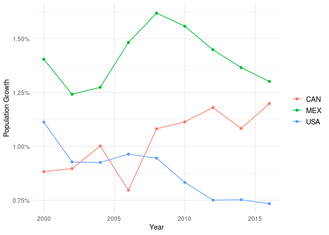
Here we create a line graph with the SP.POP.GROW indicator from the ‘wb_pop’ dataset we created earlier based on world bank data. SP.POP.GROW is the percent population growth of a country and we divide its value (which is in the ‘value’ column) by 100 to convert it to a decimal percentage value.
In this example, both lines and points are displayed for our data because we have used both the geom_point and geom_line functions. The expansion function is used to control the margins in the x axis. We’ve also formatted the y axis as a percentage using the ‘labels’ argument in scale_y_continuous.
ggplot(
  wb_pop %>% filter(country %in% c("USA", "CAN", "MEX") & indicator == "SP.POP.GROW"),
  aes(x = year, y = value / 100, color = country)
) +
  theme_minimal() +
  geom_line() +
  geom_point() + # lines and points
  scale_x_continuous(expand = expansion(mult = c(.05, .05))) +
  scale_y_continuous(labels = scales::percent) +
  theme(
    legend.title = element_blank(), # suppress legend title
    panel.grid.minor.x = element_blank(),
    legend.text = element_text(size = 11),
    legend.position = "right"
  ) +
  xlab("Year") +
  ylab("Population Growth")
Histograms
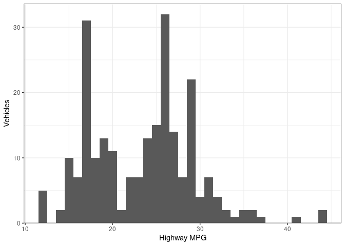
Histograms display distributions of variables. We use a histogram to look at the distribution of highway MPG below. You may want to experiment with the ‘binwidth’ argument in the geom_histogram function to see how it effects what your histogram looks like. The expansion function is used to control the margins in the y axis.
ggplot(mpg, aes(hwy)) +
  geom_histogram(binwidth = 1) +
  theme_bw() +
  scale_y_continuous(expand = expansion(mult = c(0, .05))) +
  xlab("Highway MPG") +
  ylab("Vehicles")
Bar Charts
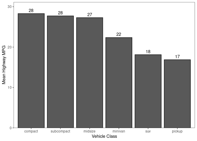
Bar charts are commonly used to show relative size and can be created with geom_bar. I find it helpful to order the bars by their size which I’ve done with the reorder function below. The geom_text function is used to add the labels to the top of the bars.
ggplot(
  data = mpg_stats,
  aes(x = reorder(class_c, -mean_hwy), y = mean_hwy)
) +
  geom_bar(stat = "identity", color = "black") +
  scale_y_continuous(expand = expansion(mult = c(0, .1))) + # expand top margin
  geom_text(aes(label = round(mean_hwy)), vjust = -0.5) + # label bars
  theme_bw() +
  xlab("Vehicle Class") +
  ylab("Mean Highway MPG") + # no axis labels
  theme(panel.grid = element_blank()) # turn off grid
Lollipop Charts
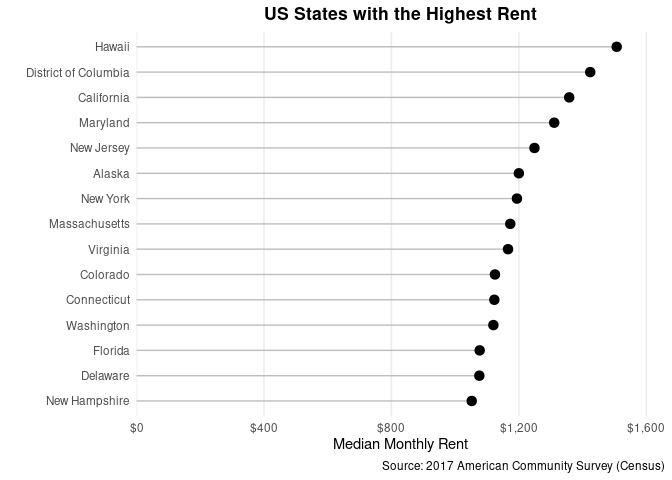
Lollipop charts can be an attractive alternative to bar charts. We construct one here using geom_segment and geom_point. The coord_flip function is used to orient the chart horizontally instead of vertically. We use the theme function to hide all grid lines except for the major vertical lines. The reorder function is again used to order the axis (in this case by rent in descending order).
ggplot(data = col_ratio %>% arrange(desc(rent)) %>% head(15), aes(x = NAME, y = rent)) +
  geom_segment(aes(x = reorder(NAME, rent), xend = NAME, y = 0, yend = rent), color = "grey") +
  geom_point(size = 3) +
  theme_minimal() +
  theme(
    plot.subtitle = element_text(face = "bold", hjust = 0.5),
    plot.title = element_text(lineheight = 1, face = "bold", hjust = 0.5),
    panel.grid.minor.y = element_blank(),
    panel.grid.major.y = element_blank(),
    panel.grid.minor.x = element_blank()
  ) +
  coord_flip() +
  scale_y_continuous(labels = scales::dollar, expand = expansion(mult = c(0, .1))) +
  labs(
    title = "US States with the Highest Rent",
    caption = "Source: 2017 American Community Survey (Census)"
  ) +
  xlab("") +
  ylab("Median Monthly Rent")
Additional References
Here are some additional resources that you may find useful:
- For importing data from files, refer to the readr (for CSV and text files) or readxl (for excel spreadsheets) packages.
- To coerce a column in a dataset into a different format, you can use the as.numeric, as.character, as.Date, and as.factor functions (from base R). For more functions to work with date and datetime data see the lubridate package, for strings reference the stringr package, and for manipulating factors you can use the forcats package.
- For quickly summarizing datasets with basic summary statistics, you can use the summary function (base R) or the skimr package.
- The purrr package allows you apply functions across the values of a list using the map function. One example of where this is useful is in reading and combining data from multiple sheets in an excel spreadsheet by applying a function that reads a single sheet to a list of sheets.
- I keep reference data science code (both R and Python) in a GitHub repository. You’ll find some more advanced techniques like modeling demonstrated there.
March 26 2021: this post has been updated to reflect changes in ggplot and dplyr syntax.